
Jefferson County Council on Aging
Introduction
My team was assigned the mission of crafting a revamped brand identity that focused on enhanced visibility and inclusivity to attract new members to JCCOA. The council aimed for a modern, vibrant design that effectively communicated their range of services for older adults.

Mood board with selected words that my team felt JCCOA was providing their members with.

Mind Map of ideas connecting to what health and well-being means for JCCOA.
Sketching and development
Many ideas were sketched out and explored with the concepts of of health and well-being at the center of my team’s focus. We came up with the keywords of Connections, Activity, and Safety at the center of what health and well-being meant for members of JCCOA.


Final Mark and Type Lockup
The final logo that was developed by my team includes 6 circles situated in-between five lines radiating from the center, representing togetherness.
Considerable thought was given to each of the colors we chose for this brand mark. JCCOA is an organization that helps older adults with many different services and we wanted to convey that through the use of different colors. The blue tones represent mental health and the yellows symbolize physical well-being.

This logo was chosen by JCCOA as they felt it expressed their mission and values.
Supporting Identity elements & hand-off
My team provided the JCCOA with a comprehensive set of designed materials for their daily organizational needs, encompassing banners, business cards, letterheads, design system patterns, and the final brand standards.
Color Palette

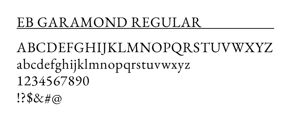
Secondary Typefaces

Signature Colors

Sizing and Area of Isolation

Design Systems


Stationery Set

Newsletter Example

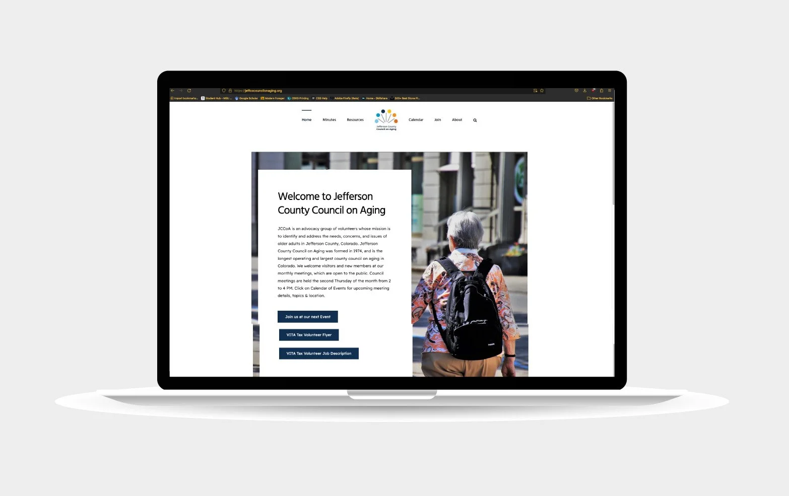
Website Use
Swag & Banners


reflection
This branding project gave me insight to how brands are built and the amount thought that goes into creating a successful brand system that reflects the companies values. My team did a lot of work and much thought went into each element of the designs. I was able learn about the follow-through and hand-off of resources to a real client.