
Ouray, Colorado
Introduction and Research
The town of Ouray commissioned our agency to develop a modern brand identity and wayfinding system. The city council sought to update their logo- aiming for a contemporary and memorable design to encourage tourism and elevate their identity among other western slope mountain towns.
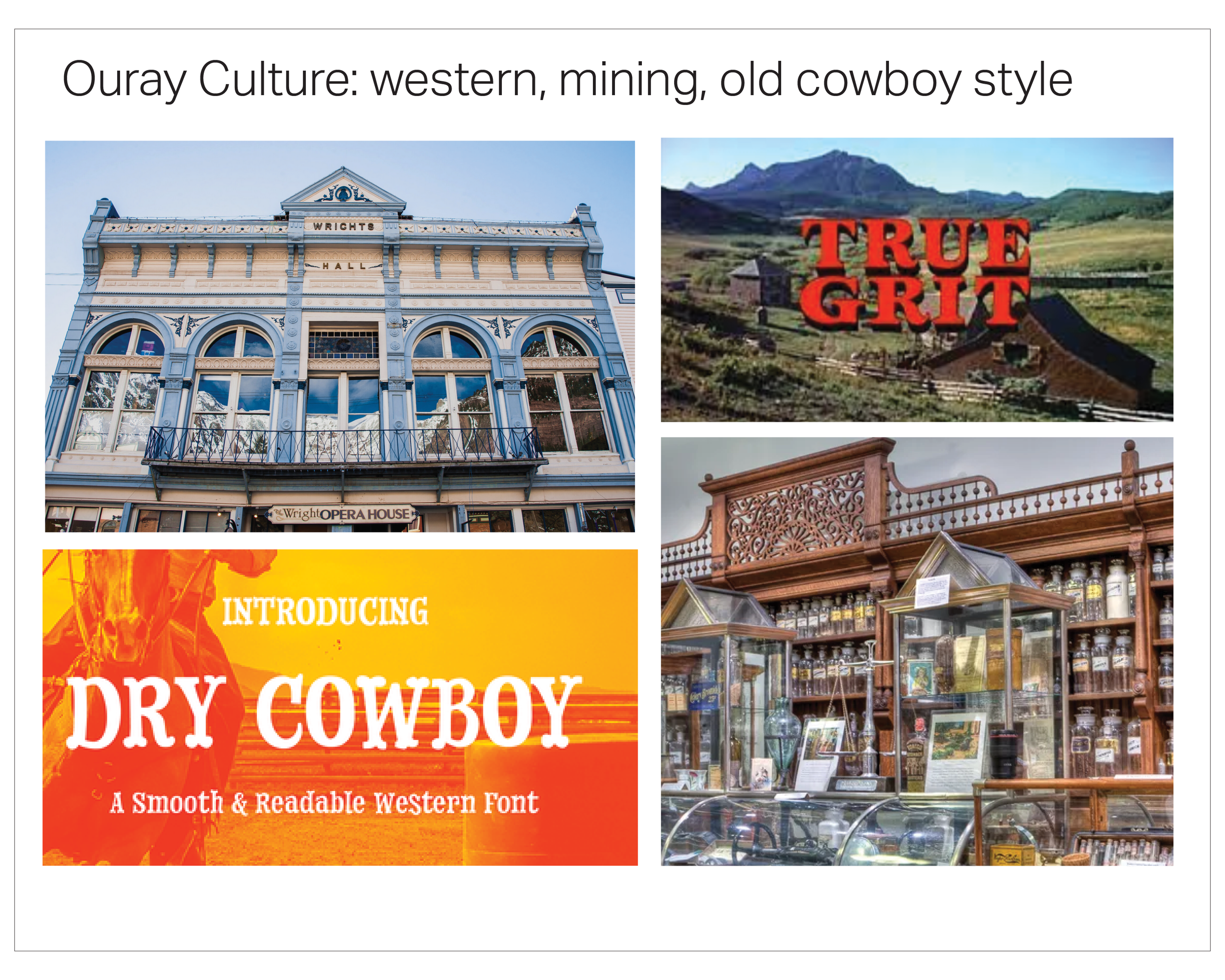
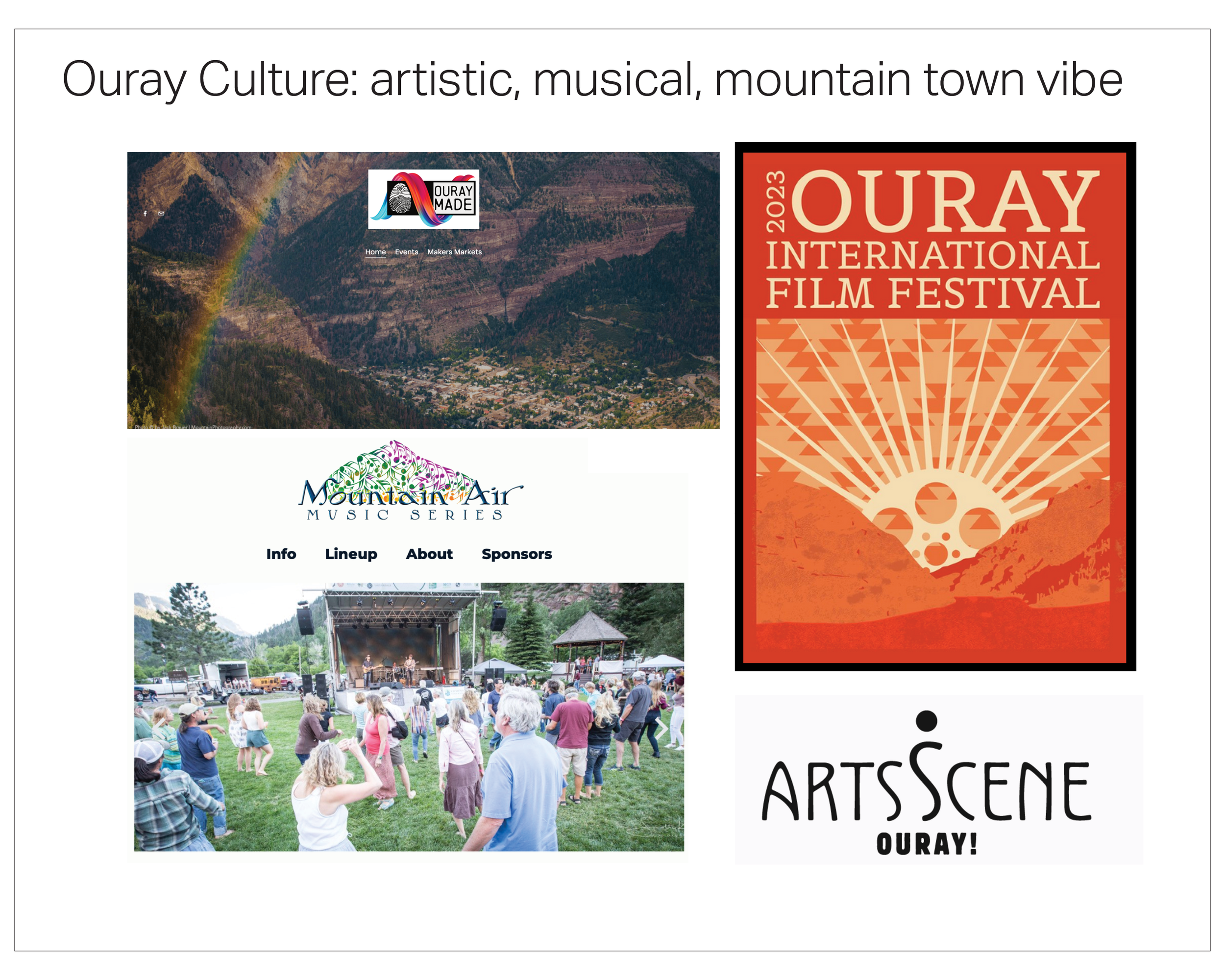
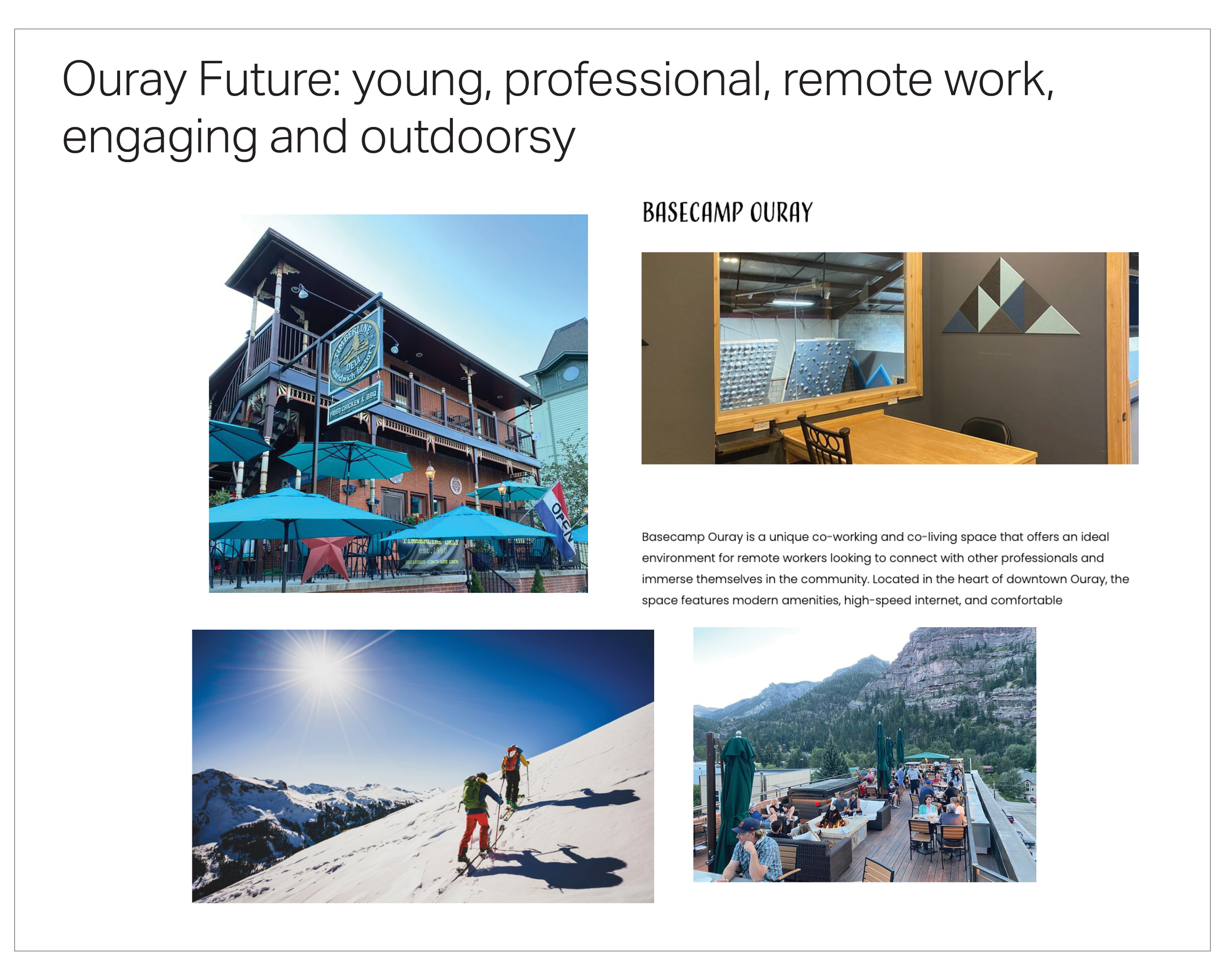
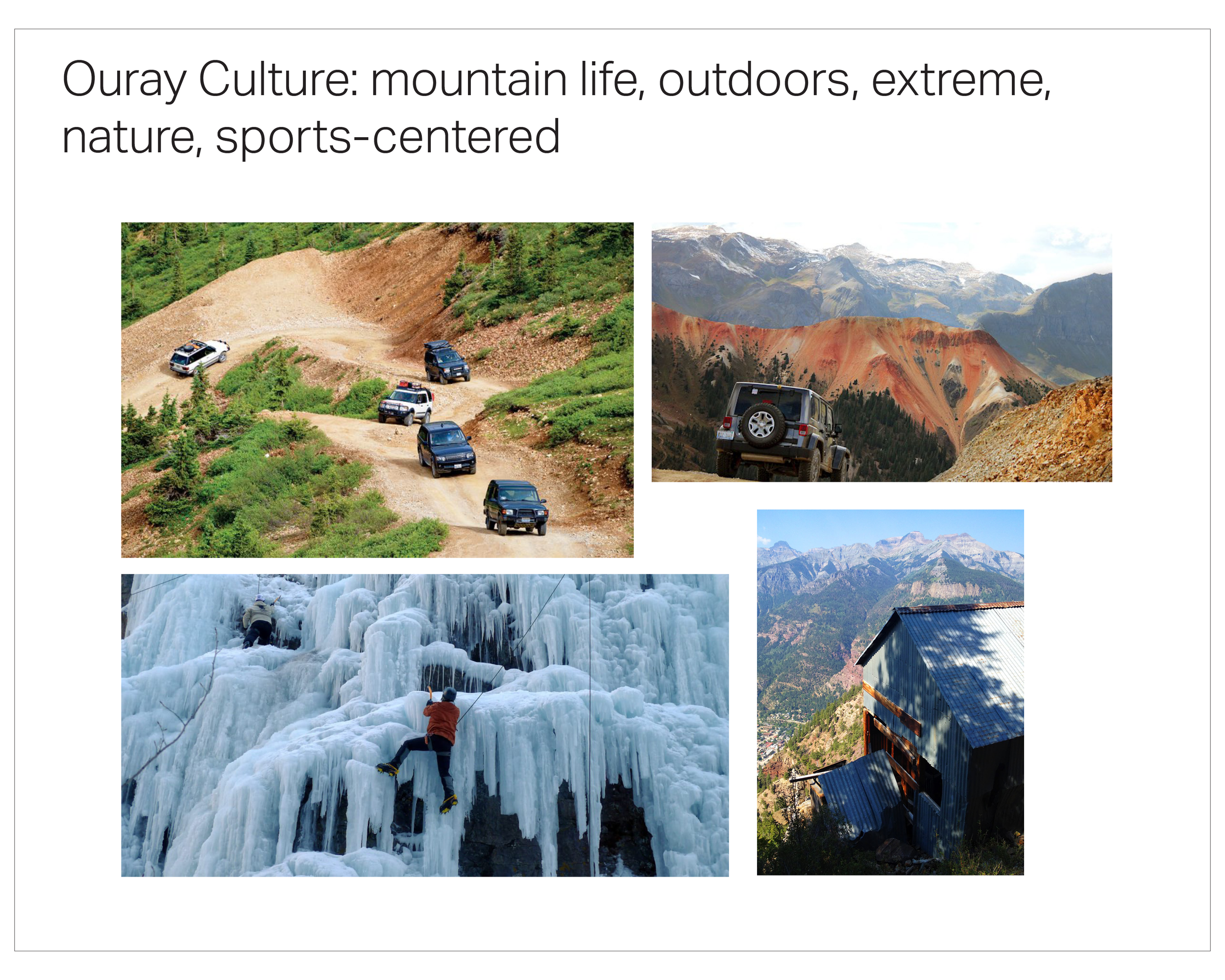
My team researched heavily into Ouray, including the culture of the town, the hopeful future for development, and their chosen typography style in order to develop a focus for vision.

Iterative Development
We employed initial sketching and refined concepts in Illustrator to design and enhance the marks, continually iterated with input from our creative director for a stronger, more cohesive connection with Ouray.
Typeface & Color Palette
The city council requested that the type and logo be versatile for standalone use when necessary. In the initial meeting, Ouray expressed a desire for a modern typeface with a touch of the old cowboy block type aesthetic.
Additionally, we selected colors inspired by the town's outdoor surroundings, creating a connection with both the local residents and tourists.
For the logotype we employed a contemporary slab serif that had the block-type cowboy font the client wanted. They asked for a logotype that would be able to stand on it’s own and have the same level of recognition as the mark.
Chosen Mark
Combination Mark and Typeface
Secondary Typeface

Color Palette

Stationery Sets
My team crafted two distinct stationery sets for both the city department and the tourism department, respectively. The city department set uses the grayscale version of the mark and logotype along with a gray geometric band design that pulls inspiration from the local indigenous tribe, the Ute Mountain people. We wanted to make a set for the city workers that could be easily reproduced on normal office printers.
For the tourism department, we chose to use the full color mark, logotype, and indigenous geometric band because that team would be getting their materials professionally printed.


Destination Badges
Ouray, Colorado has many areas for tourists to explore and enjoy the outdoors. The few destinations below were chosen specifically because they are the highest visited in Ouray and the city council wanted these location to be integrated with the new brand first. These “badges” are to be used at each location and are available for the shop owners to use on any gear or merch that they wish to sell.

Reflection
Building a brand identity for a small town can be challenging as there were many unique voices and opinions in the council. We incorporated all their input into the mark and subsequent supporting design elements to help this city step into a more modern identity that will stand timeless for years to come.