

Bank Street TYPEFACE
INTRODUCTION & RESEARCH
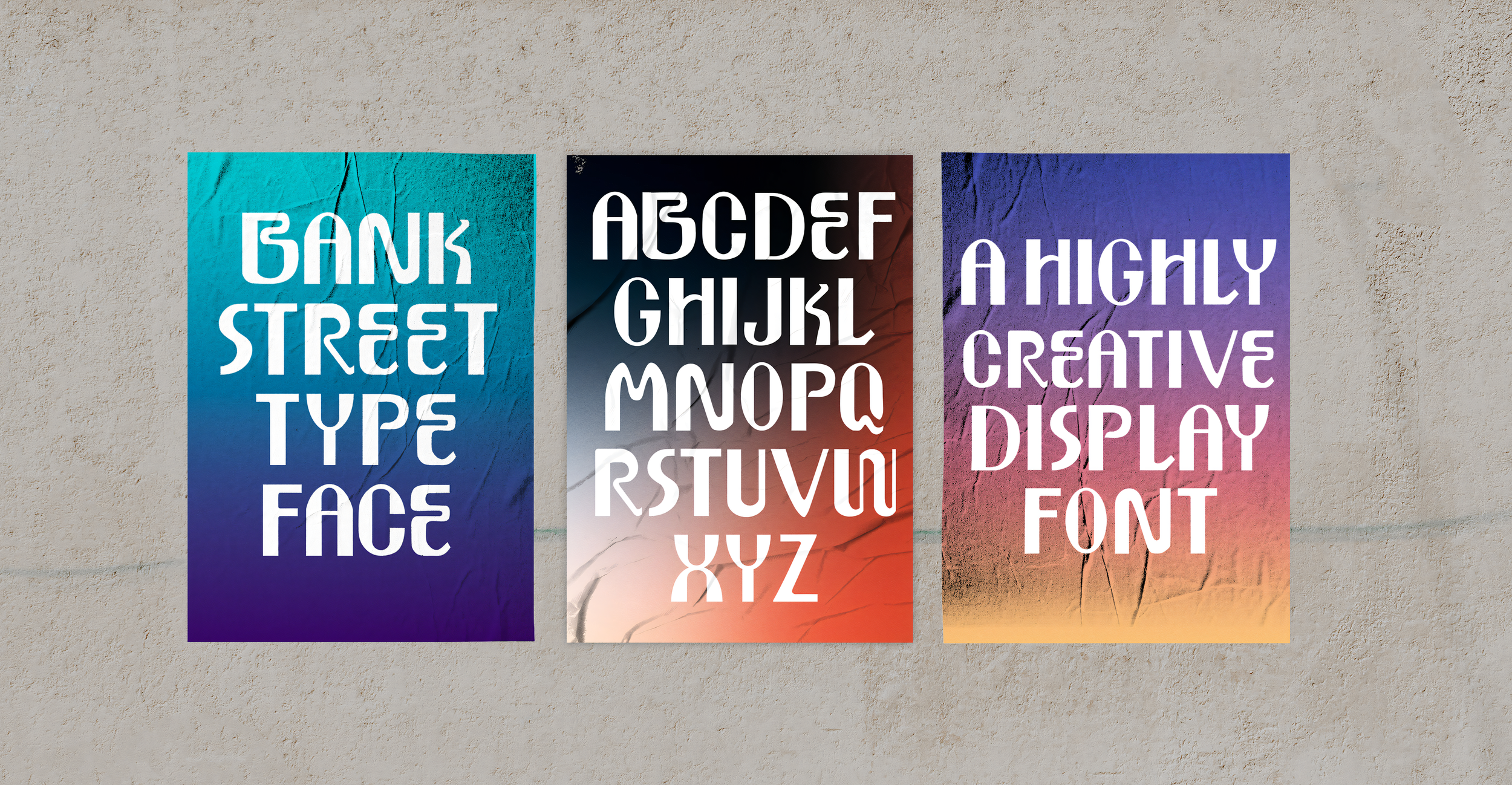
This display typeface draws inspiration from New York City’s energy: its diversity, character, and the city’s long-standing tradition of Art Nouveau signage and lettering.
The goal of this project was to design a display font that feels bold and distinctive while remaining clean, readable, and structurally sound. The result is a typeface defined by curving, expressive letterforms that blend Art Deco influences with oblong shapes and minimal contrast. It captures the spirit of the city itself- dynamic, gritty, and full of personality.


The ‘W’ that started it all

The inspiration for my W came from Chloe Wise’s catalog book entitled "Second Nature".

My W is a sans serif infused with art deco style.
Up Close Letter-forms


THE ALPHABET & MOCK UPS


